Randomizing the extrinsic parameters#
We want to achieve the same result as in the previous tutorial, but this time instead of fixing all the parameter values, we will randomize some of them, in order to get a better feel of how the error distribution looks in general.
This is still not a realistic scenario — for that, we’d need to look at the mass distribution of neutron star mergers in redshift at the very least — but it illustrates several points which are relevant for more advanced usage.
Randomized population#
We aim to randomize:
the position of the source in the sky (
ra,dec)its orientation with respect to the detector (
theta_jn,psi)the time and phase of arrival of the signal (
geocent_time,phase)
We will need to generate some random points on a sphere for the angular distribution both of the source in the sky, and its orientation with respect to the observation axis.
A point \((\theta, \varphi)\) (the usual spherical coordinates) is uniformly distributed on the sphere if \(\varphi \sim \mathcal{U}(0, 2 \pi )\) while \(\theta \sim \sin \theta \). Generating both angles with a uniform distribution would bias our points towards the poles.
The easiest way to generate a point distributed like a sine is to use the relation
therefore we can generate a number \(x \sim \mathcal{U}(-1, 1)\) and take its arccosine
to get a sine-distributed variable. We need to do this both for theta_jn and dec.
We will generate 10 such samples - not enough to get good statistics, but it will suffice for this tutorial, and it will allow us to run quickly.
>>> import pandas as pd
>>> import numpy as np

>>> rng = np.random.default_rng(seed=1)

>>> ns = 10
>>> one = np.ones((ns,))
>>> parameters = pd.DataFrame.from_dict({
...    'mass_1': 1.4*one,
...    'mass_2': 1.4*one,
...    'redshift': 0.01*one,
...    'luminosity_distance': 400*one,
...    'theta_jn': np.arccos(rng.uniform(-1., 1., size=(ns,))),
...    'dec': np.arccos(rng.uniform(-1., 1., size=(ns,))) - np.pi / 2.,
...    'ra': rng.uniform(0, 2. * np.pi, size=(ns,)),
...    'psi': rng.uniform(0, 2. * np.pi, size=(ns,)),
...    'phase': rng.uniform(0, 2. * np.pi, size=(ns,)),
...    'geocent_time': rng.uniform(1735257618, 1766793618, size=(ns,)) # full year 2035
... })
This will generate a population file for which we can generate the Fisher matrix errors just like discussed in the simulation section of the previous tutorial:
>>> from GWFish.modules.detection import Network
>>> from GWFish.modules.fishermatrix import compute_network_errors

>>> network = Network(['ET', 'CE1', 'CE2'])

>>> detected, snr, errors, sky_localization = compute_network_errors(
...    network,
...    parameters,
...    waveform_model='IMRPhenomD_NRTidalv2'
... )

>>> snr = snr[detected]
>>> errors = errors[detected, :]
>>> sky_localization = sky_localization[detected]
Note
This will take on the order of a few seconds on a typical laptop. You should see a progressbar on your terminal screen.
Interpreting the results#
Now that we have access to the results, we can make plots, such as histograms:
>>> import pandas as pd
>>> import matplotlib.pyplot as plt
>>> import numpy as np
>>> from matplotlib import rc
>>> from GWFish.modules.fishermatrix import sky_localization_percentile_factor
>>> rc('text', usetex=True)

>>> skyloc_ninety = sky_localization * sky_localization_percentile_factor()
>>> _ = plt.hist(np.log(skyloc_ninety), bins=10)

>>> _ = plt.xlabel(r'90% sky localization error, square degrees')
>>> _ = plt.ylabel('Counts')
>>> plt.gca().xaxis.set_major_formatter(lambda x, pos: f'${np.exp(x):.2g}$')

Histogram of the sky-localization of a GW170817-like signal, with randomized orientation.#
or scatter plots:
>>> import pandas as pd
>>> import matplotlib.pyplot as plt
>>> import numpy as np
>>> from matplotlib import rc
>>> from GWFish.modules.fishermatrix import sky_localization_percentile_factor

>>> rc('text', usetex=True)

>>> skyloc_ninety = sky_localization * sky_localization_percentile_factor()
>>> _ = plt.scatter(np.log(skyloc_ninety), np.log(snr))

>>> _ = plt.xlabel(r'90% sky localization error, square degrees')
>>> plt.gca().xaxis.set_major_formatter(lambda x, pos: f'${np.exp(x):.2g}$')

>>> _ = plt.ylabel('Network SNR')
>>> plt.gca().yaxis.set_major_formatter(lambda x, pos: f'${np.exp(x):.0f}$')
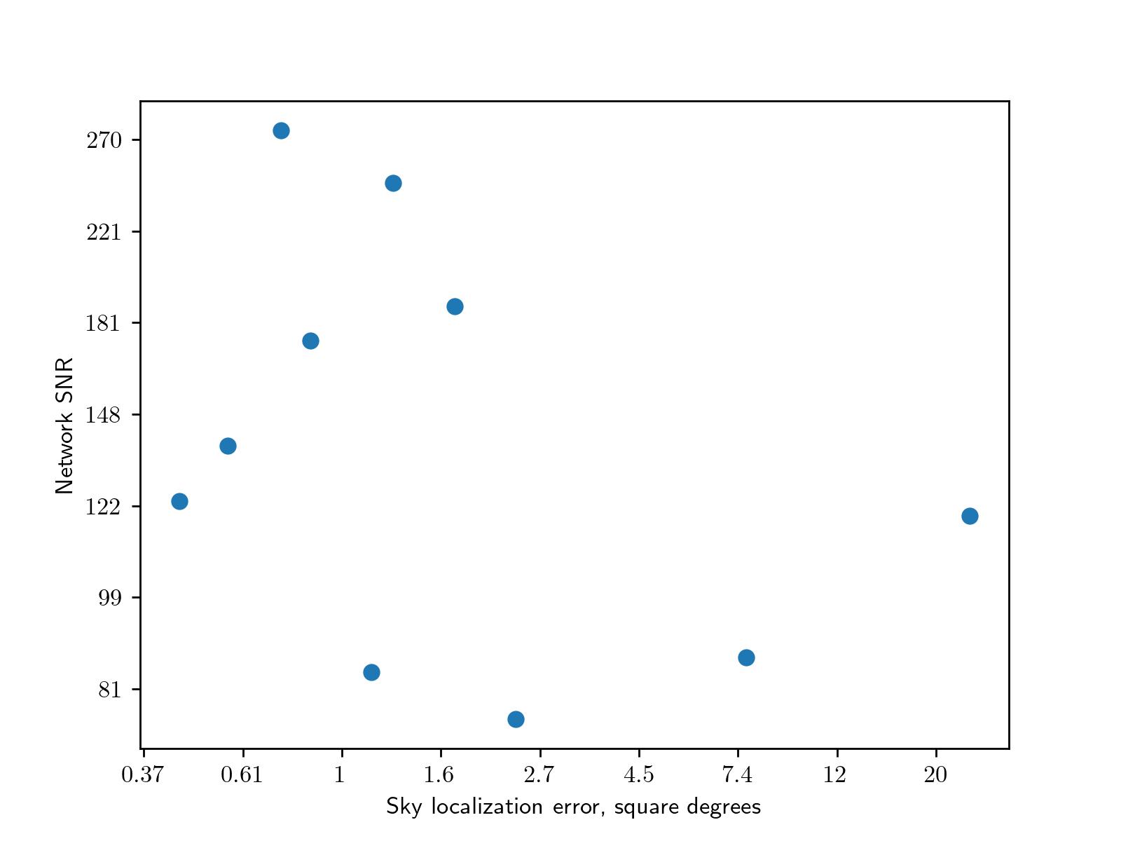
Scatter plot of the sky localization against the signal SNR.#
Note
The funky things going on with the axes formatting are due to the care one must take when making histograms with log-scale axes.
Doing something like plt.hist(var); plt.xscale('log') leads to a very misleading plot,
with changing bin sizes.
Instead, we should histogram the logarithm of our variable — that way, we get the
correct probability density per decade / octave / e-fold etc.
The problem with this is that if we plt.hist(np.log(var)) the labels of the
axis will be the logarithms of what we care about.
We must therefore change the formatting to be the exponential of the values
on the axis.